Abstract:
Increasingly, decision making is being informed by access
to large amounts of data and statistical analysis.
However, many decision makers don’t have formal
statistical training. In this paper we propose an interactive
system that uses touch and visualizations to accurately
communicate statistical concepts to novice audiences.
Specifically, we report on the challenges of designing a
system to communicate the results of a common
statistical comparison (t-tests) to business audiences at a
technology company. Our visualization attempts to clarify
data anomalies that are often neglected while presenting
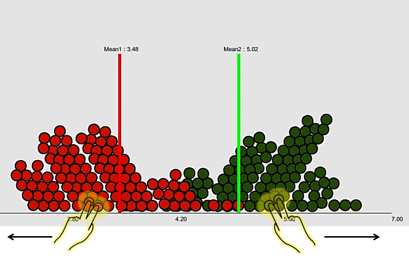
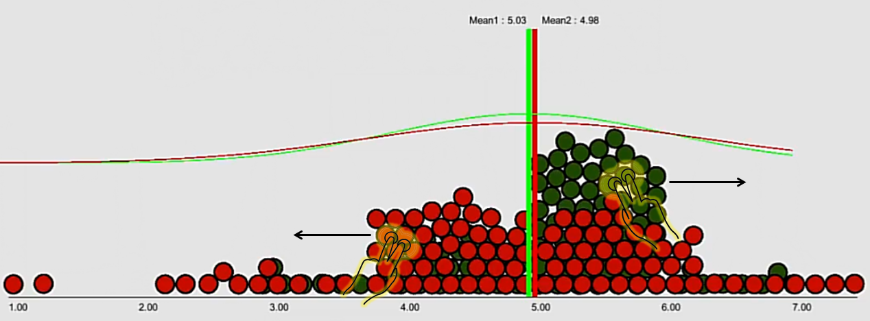
t-test results (i.e. bimodal data, low sample size and
outliers) via data behaviour and inclusion of common
physical metaphors associated with communication of
statistics (i.e. ‘pulling out outliers’). Our iterative design
process ultimately led us to draw upon data
physicalization techniques such as constructive
visualization in order to inform our solution.
Researchers: Sowmya Somanath, Ian Hargreaves, Edward tse, Kazuki Takashima, Ehud Sharlin